Using relative layout is bad Link to heading
.. or at least they say so. The truth is, it is relatively easy to build complex layouts using RelativeLayouts, but this ease of use comes with a cost: in order to provide that kind of flexibility, RelativeLayout does two measurement passes.
There are a lot of talks and posts explaining that if you have nested relative layouts, you’ll end up with many measurement passes that will consume your cpu and will contribute to miss the dreaded 16 ms threshold. The higher the RelativeLayouts are placed in your view hierarchy, the more will be the number of measurements.
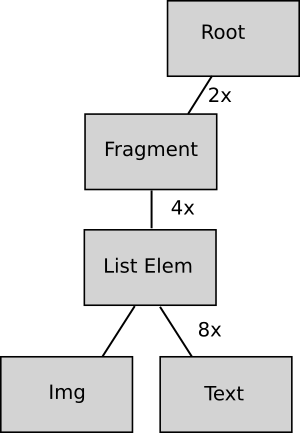
It’s easier than you think: let’s pretend you have a RelativeLayout as the root of your activity view (because hey, it’s what Android Studio sets as default from the BlankActivity template).
Then you have a fragment, and for some reason you have a list you want to place aside a button and you need a RelativeLayout over there.
Finally, you’ll have to place an image and a text inside the list elements, isn’t there an easier way than RelativeLayout? (Actually, there is and it’s much more efficient)

What will happen here is that with this unharmful scenario the onMeasure() method of each children of the list will be called 8 times each frame.
But why does RelativeLayout need two passes? Link to heading
Given that Android is an open source framework, I could satisfy my curiosity by digging into the source code. Here I will try to provide a high level explanation of my understanding on how it works, without going too much into the details.
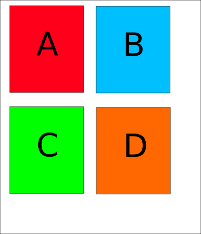
Let’s pretend you want four children (A, B, C, D) for your layout, and the rules are the following:
- A is above C
- B is to right of A
- D is below B and its right margin is aligned to B
- C is to left of D and its top is aligned to D

The concept behind RelativeLayout is fairly simple. In order to measure (and place) a certain child, you need to measure (and place) all the views that child depends on in term of relationship. For this reason, the first thing RelativeLayout does is to build a graph of dependencies between the children. Those dependencies determine the order in which the children are measured (i.e. first the views with no dependencies, then the views that depend only from the root, etc).
This explains the need for two measurement passes: the order the views need to be measured horizontally can be different from the order the views need to be measured vertically. In my example, A does not have any horizontal dependency but vertically it depends on the size and the position of C.
In the example, the sequence of measurement are:
Horizontal dimension: A -> B -> D -> C

Note that given the vertical size is not calculated yet, the views are temporarly assigned with the height of the parent view while measuring the horizontal sizes.
Vertical dimension: B -> D -> C -> A

Other than these two passes, RelativeLayout can also loop its children up to three other times to finalize their placement (for example for those that are aligned to the bottom of the parent in case of wrap content).
The position of the views is calculated during the measurement double pass. For this reason the onLayout() implementation is pretty trivial.
Finally, the dependency lists are cached, but those cached elements are invalidated whenever a requestLayout() happens. This, together with the fact that requestLayout() goes up to the root and is called on all the children is another reason for not having deep view hierarchy especially with RelativeLayouts.
Optimizing RelativeLayout Link to heading
First of all, remember that you don’t always need to. If you are in the early stage of the development or under strict time constraints and you prefer the simplicity of use of RelativeLayout against performance then use it, just be aware of the implications. This small piece of technical debt might come back in the future to claim its price.
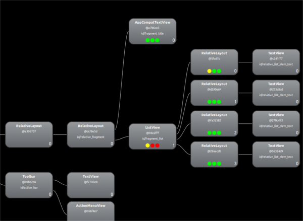
Measure twice and cut once (but remember to do that from time to time). Hierarchy Viewer is a convenient way to understand if your hierarchy is too complex and to see at glance what’s costing too much:

Probe by Lucas Rocha is also an effective tool to check if your views are getting measured too many times.
After that, if you realize that your view groups suffer from performance issues, the most efficient way to optimize is to write a custom viewgroup. It might look scary at first, but it’s just a matter of measuring and placing boxes knowing exactly where you want to place them and how their container looks like. This will flat your hierarchy and make it a lot more efficient.
I don’t want to write (yet another) tutorial on building custom viewgroups here since it will double the lenght of this post, but some good starting points are:
- Dave Smith’s post on custom views
- Sriram Ramani’s post on custom viewgroups
- This talk from google io 2013
- Loving lean layouts from Droidcon SF
What’s the take home lesson Link to heading
RelativeLayout is an awesome piece of software. It makes it super easy to describe complex scenarios without needing to do nasty nested linear layouts.
However from today, before placing it inside a view I will start thinking not only about the two passes, but also to all the hard work this complex piece of software needs to do behind the scene in order to offer me the flexibility I am used to.
The two measurement passes can be the biggest source of problems because of the risk of exponential explosion, but other than that there are a lot of computation and additional data structures involved in building (and maintain) those dependency lists, and a good amount of extra loops through the children needed to place them correctly.
Thanks to Riccardo Ciovati and Fabio Collini for proofreading this post.